Drinking Windows


Mobile app
B2C
Research
Company
Vivino
Stakeholders
Product manager, designers, developers, wine experts, end users
Overview & impact
01
Foundations
The Product
Vivino is the world's largest online wine marketplace, most downloaded wine app, and home to a community of ∼69 million wine drinkers worldwide. In 2023, Vivino launched Vivino Premium, a feature-rich subscription focused on enhancing user experience by offering personalized content aimed on engagement, education, and personal tracking.
Problem space & goals
Vivino's drinking window feature, allowing users to manually input the best time to drink a wine, saw low engagement as it was often overlooked. Moreover, many users requested ideal drinking window insights highest amongst all requests. To meet this demand, Vivino wanted to implement recommended drinking windows as part of Vivino Premium and hereby:
Increase Vivino Premium subscriptions by offering valuable, expert-recommended drinking windows to enhance the user experience.
Improve feature satisfaction and usability for both enthusiasts and casual users by providing accurate and convenient wine recommendations.
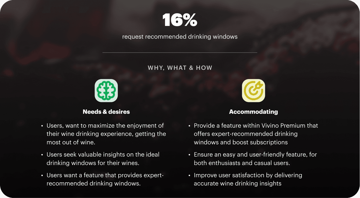
Figure showing the demand for recommended drinking windows
Balancing wine experts and newbies
The new drinking window feature aims to benefit both wine experts and casual drinkers in the Vivino community. It was vital to balance the design to cater to different groups, ensuring that:
Wine experts found it helpful and saw use with the feature
Hands-on users were in control and could easily set their own
Casual users could use it and didn't find it overly advanced
Limitations: deadline & resources
Since this was one of the most requested tracking and managing wines, and Vivino had recently just launched Premium the feature needed to be pushed within a relatively short window. Moreover, Vivino's challenge of having a small product team made more qualitative research difficult.
02
THE DESIGN JOurney
Understanding the basics
My initial challenge as a designer was to understand the users and grasp the basics of drinking windows. By collaborating with Vivino's wine expert team, I developed an understanding of the various stages of a full drinking window and the additional technical states present on the Vivino platform due to backend complexities.
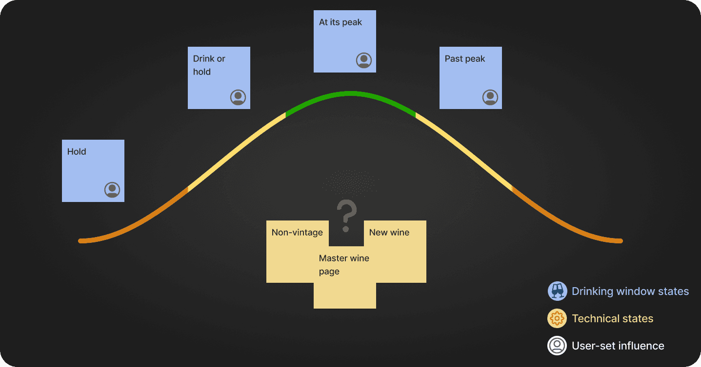
Note mapping of different drinking window states + technical factors
Competitor research
Having mapped out the different states of our upcoming recommended drinking windows, including the technical ones, I conducted a quick competitor analysis. I focused on Oeni, Vinify, and particularly CellarEye, which allows users to both see recommended drinking windows and set their own. This helped me in two key ways:
Understand design standards and flow within the industry
Identify opportunities where Vivino could gain a competitive edge
Flow study of CellarEye's 'insight' and edit/add drinking window flow
Identifying interaction constrains
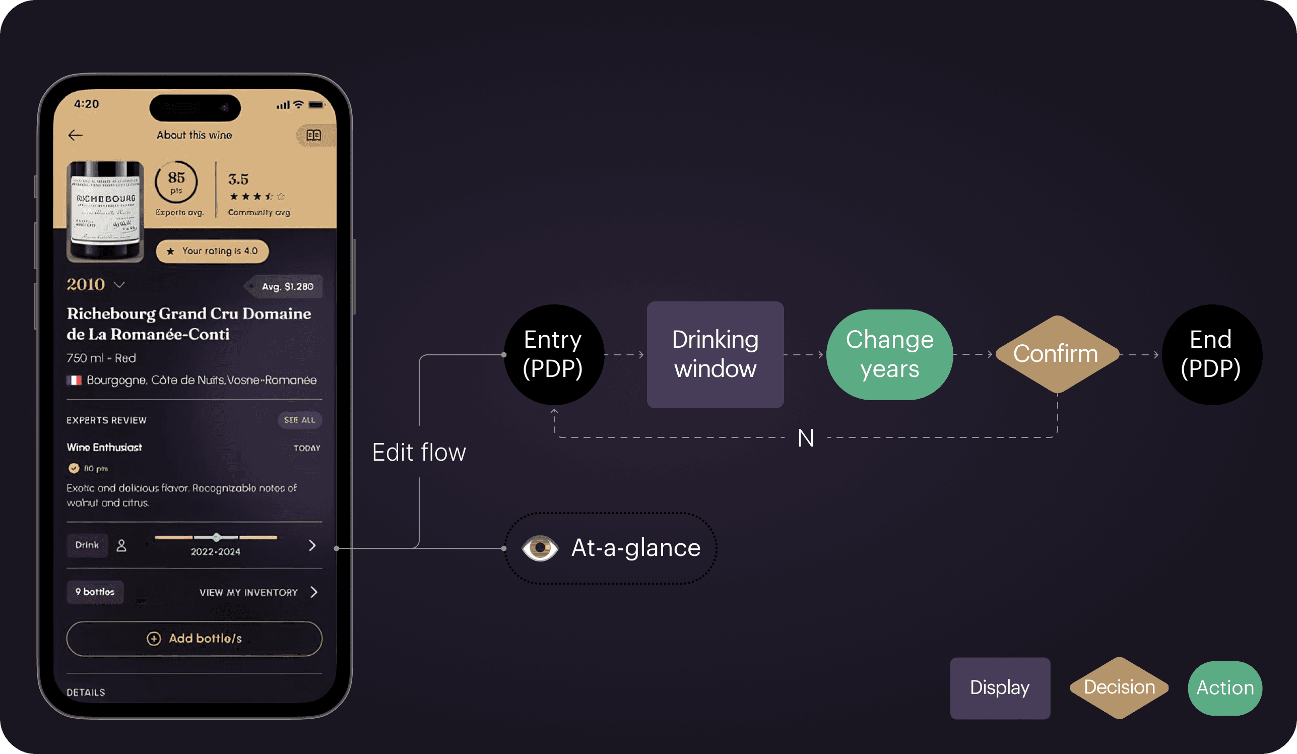
When planning the new drinking window feature, I faced an issue with the existing wine product detail page (PDP) structure. Doing a bit of UX spring cleaning, the design team had just collected all actions in a bottom sheet accessed through one button. Secondly, with the recent launch of Vivino Premium, one key feature was providing at-a-glance personalized preference insights for premium users.
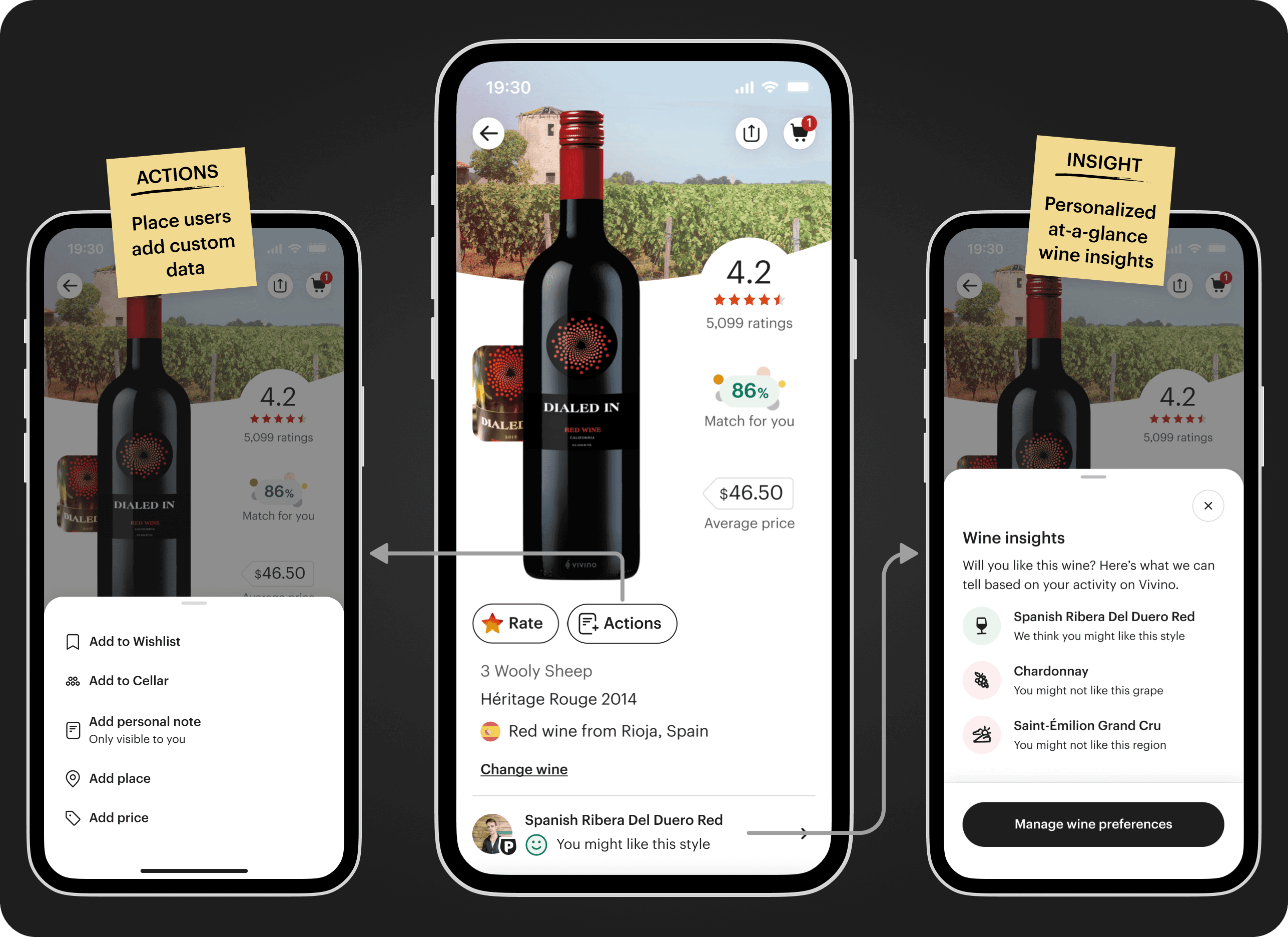
Illustration for Vivino's separation of actions and insights on a PDP
This meant that actions and insights were separate things. This also meant that the new drinking window would need to live in both places since we wanted to continue to allow users to add their own drinking windows, but also communicate recommended drinking windows at-a-glance for users.
Making the design
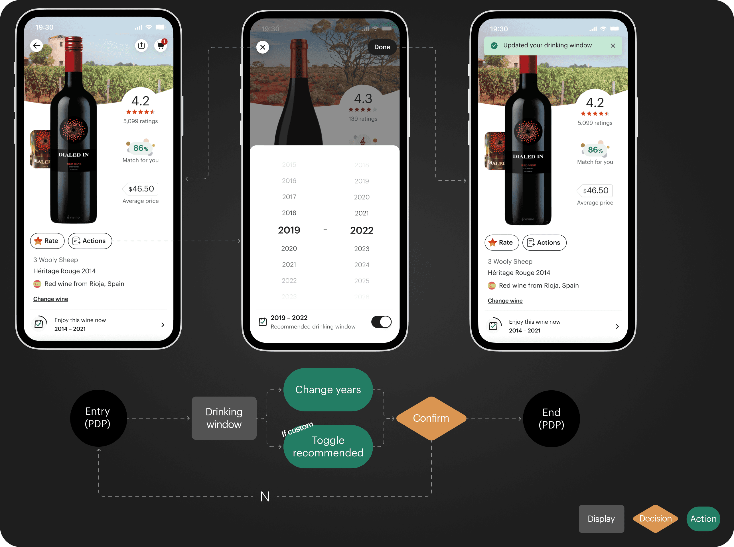
Since the interaction constraints outlined earlier determined element placement, the design process followed a fairly systematic approach. The first step meant adding the recommended drinking windows to the insights. However doing so meant reviewing the entry point, the carousel, which introduced two problems the new design should fix:
Overcrowded with visuals and had a profile image, premium badge and a smiley face on a small space
Lack of indicators which meant no way to see the number of carousel elements
Illustration of fixing edits applied to the insight carousel
Next, it was the matter of addressing the separate interaction patterns, and design the recommended drinking window to fit within insights and adding a custom drinking window in actions. It was important that the insight served as a personalized opportunity, while adding one's own drinking window was a user action. Starting with actions, I designed it with two things in mind:
Distinguishing between free and premium users which was essential since the flow would be different.
Competitor inspired flow to save time due to the short deadline
Design and flow for the action of adding custom drinking window
A step back to design consistent
With a small product design team, conducting thorough qualitative research was difficult. This meant, testing this new features design was done through critique meetings, where the design team could evaluate and provide feedback on the solution. With the provided feedback, I made some revisions:
Changing visual elements to better adhere to the design system
Refine terms for drinking window states by collaborating with the wine expert team
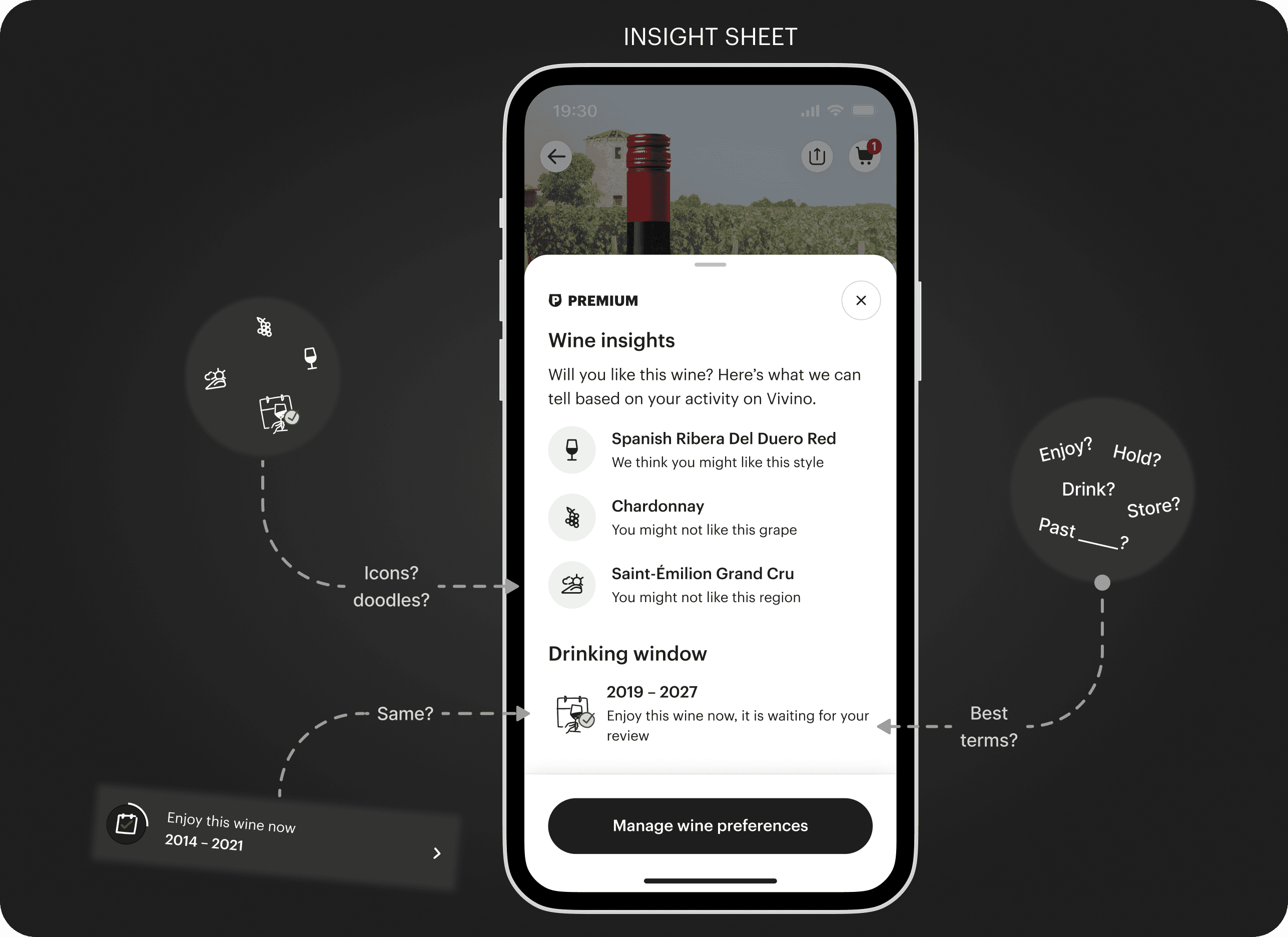
Illustration on some design critique feedback & concerns
Structuring flows & states
The final thing to do was to handover the designs, of the flows, states, and animated elements to the engineers.
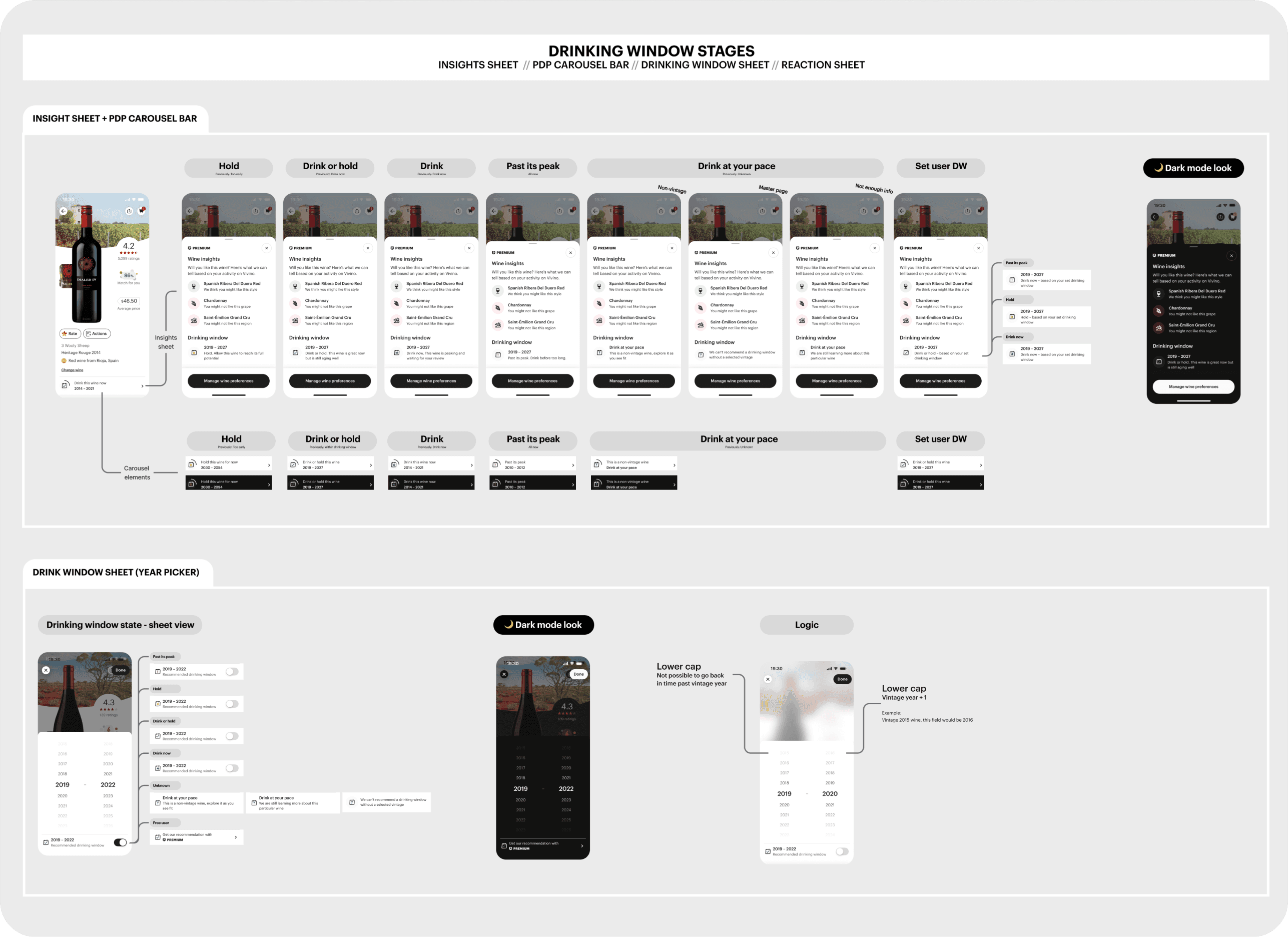
Snippet of the handover Figma page. With states and logic for the insight sheet
03
Takeaways & outcome
Learnings
This project presented a set of challenges, many of which were new to me. Despite being difficult, they were also very interesting to tackle. Ultimately, I learned a handful of skills worth applying in future projects:
Working with a strict timeline and deliver a project swiftly. This means evaluating where it might be smartest to cut corners. Moreover, internal design critique of the design is key if testing is limited.
Not all battles are within scope and ideally, insights and actions for the drinking window would be combined, but required tackling bigger UX issues. Sometimes, you have to make the best of what you have.
The final product
The new feature met its goals, boosting conversion, improving usability, and enhancing user satisfaction. It was featured on the Vivino Podcast and ultimately resulted in:
A 2.5% boost in weekly Premium conversion
A scalable solution for the most requested tracking feature
A better, yet improvable interaction solution


See more…


