
The Empress


Game design
Complex data
Research
Company
IT-University of Copenhagen
Stakeholders
Director, design lead, developers, artists, sound designers, end users
Overview & impact
01
Foundations
The product
The Empress was a small noir-styled walking simulator game project focused on world design and storytelling. The game is a 10 minute first-person mystery game, set in the murky town of New Crosley. A young girl continues her routine work as a bartender. After drinking a foul-tasting blend, she starts noticing discrepancies between how she and others view the city around her. She’s trying to investigate those happenings, steering cautiously of the mafia who seems to be controlling the city.
UX/UI problem space & goals
The heavily story-driven nature of the game required interfaces that allow players to trace back gathered information easily. The main challenges were designing minimalistic, clean, yet stylized interfaces that convey information seamlessly and balancing UI colors in a black-and-white game. To tend to this problem space, I designed around 3 goals:
Design minimalistic UI that also needs to fit the noir aesthetic
Ensure intuitive UX for the player immerse themselves in the lore
Provide intuitive interfaces players find easy to explore and use
Context: a short semester project
The Empress was a game developed over the span of a single semester with a team of 9 people including programmers and different designer roles. For this project I was the only UX/UI designer.
02
THE DESIGN JOurney
Research kick-off
The game's UI design process mirrored the approach suggested by Vittorio, Senior UI Artist at Mighty Bear Games. Before creating any concrete designs, thorough research into the game's theme and the psychological principles of effective UI design was essential. This was fundamental since missteps in either of these aspects could spoil the player's experience. To get a solid reasoning for my design choices I set up a moodboard, divided into two categories:
UI & systems
Aesthetic vibe
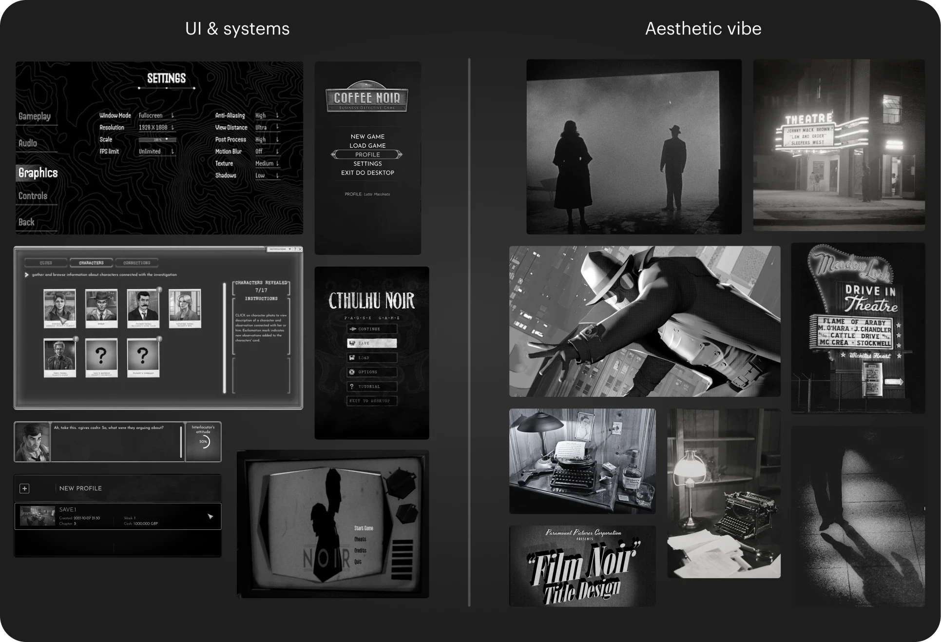
Snippet of the moodboard for both game UI and noir vibe
The moodboard research allowed me establish the framework and the four design pillars for the game's UI:
Polaroid photos/labels
Grainy/noisy background
Worn edges/icons
Old typewriter font
Illustration of the four design pillars for The Empress' UI
System before pixels
Building on the research, I set up a small design system before starting pixel work. As the game would include a fair amount of UI, I created this system to ensure consistency in spacing, colors, typography, and iconography. This framework would benefit development but also improved the final product by:
Establishing a shared language between designers and programmers
Reduced learning curve for players by ensuring interaction patterns remained similar
Enhanced player involvement thanks to clear information archtecture
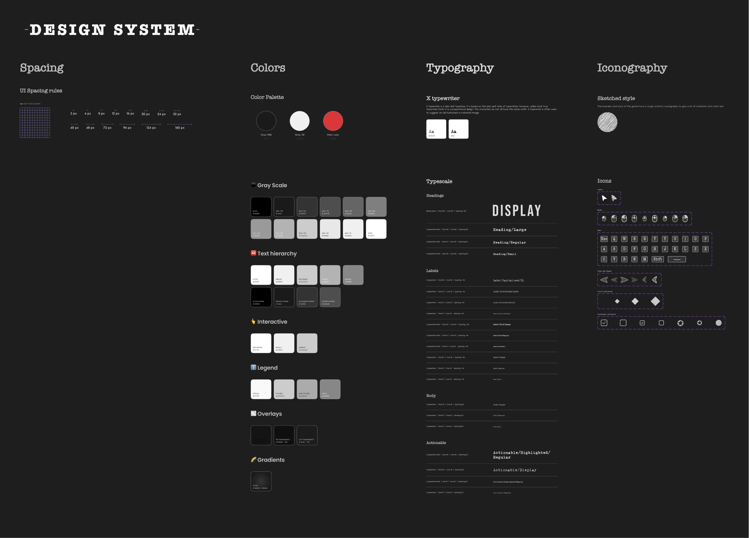
Overview of the small design design system. See the full here
Ideating
Going into the ideation process, the dialog boxes and inventory system were the first crucial designs, allowing players to immerse themselves in the game's narrative. Given our limited time, we originally opted for a stylized approach to non-playable characters (NPCs), using avatars to better convey emotions in the UI when needed. This, combined with our established design pillars, led to my first designs for dialog boxes and the inventory.
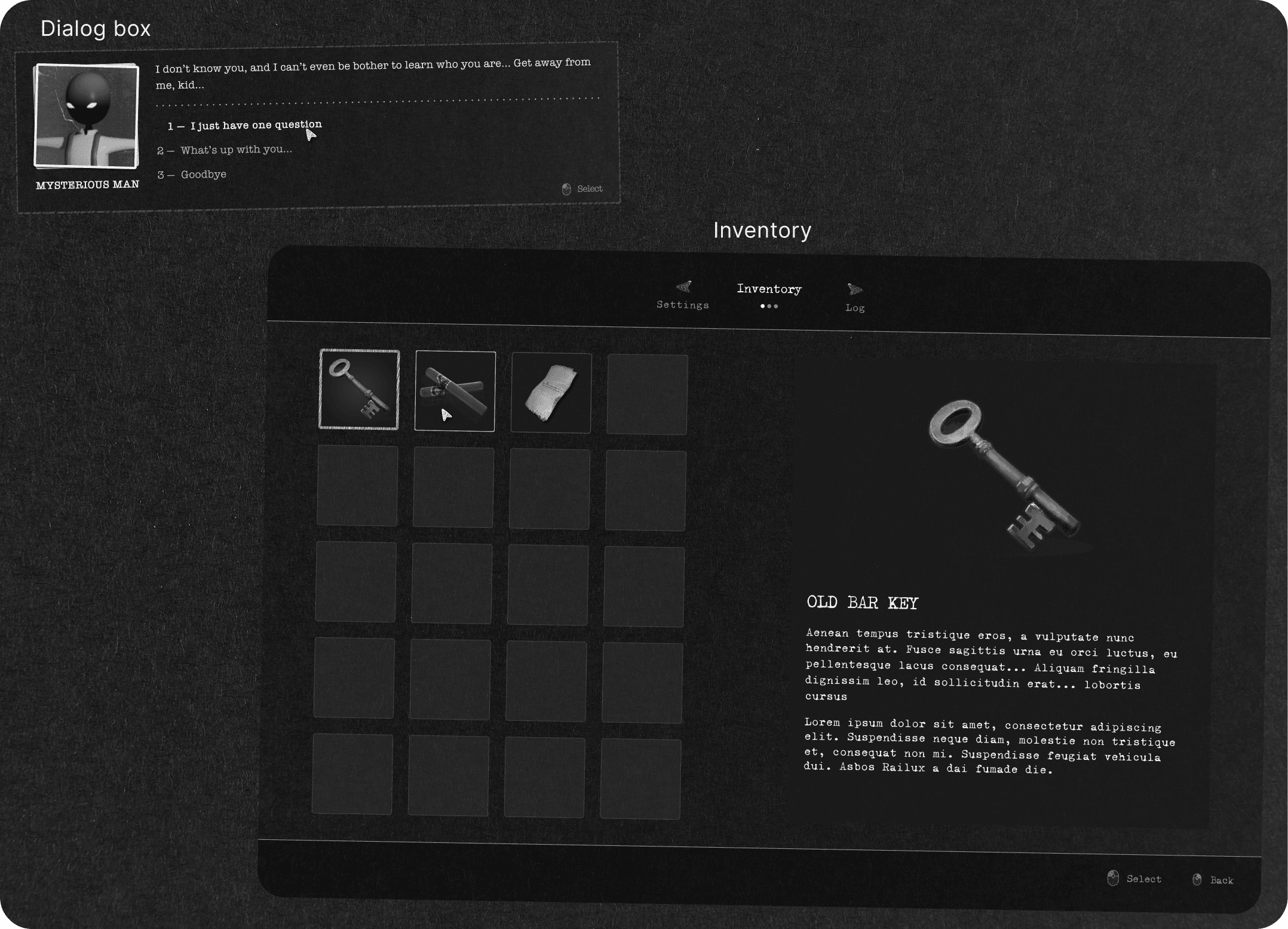
Overview of the first explorations for dialog boxes and inventory
Presenting & polishing
At this point, we had crossed the halfway point for our deadline and presented the game's current progress to our peers and professors. We received some constructive feedback regarding the current state of the UI, as it was still just the skeleton. Knowing I needed to conduct a playtest as well with room for adjustments before the final hand-in, I made some changes based on the feedback and internal shifts, like eliminating the avatars, as they were too big of a scope.
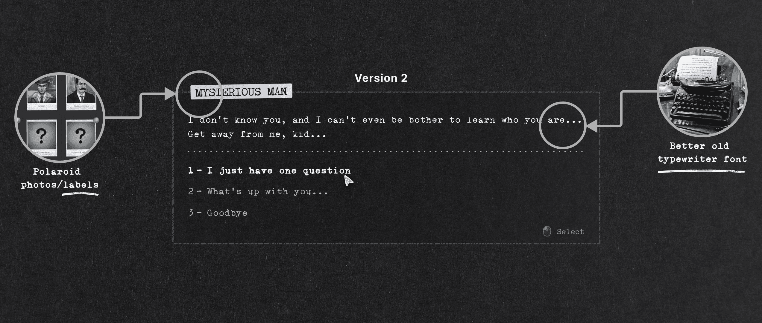
Example of changes for dialog boxes made post-presentation
Playtesting
To evaluate whether players experienced the intended emotions with our game, I conducted a playtest focusing on the game's narrative, UI, mechanics, and world. I made an empathy map for each player using Miro to understand their thoughts, feelings, and actions. As a follow-up, I interview each playtester, asking questions about the story, feel, and navigation to gather more detailed qualitative data.
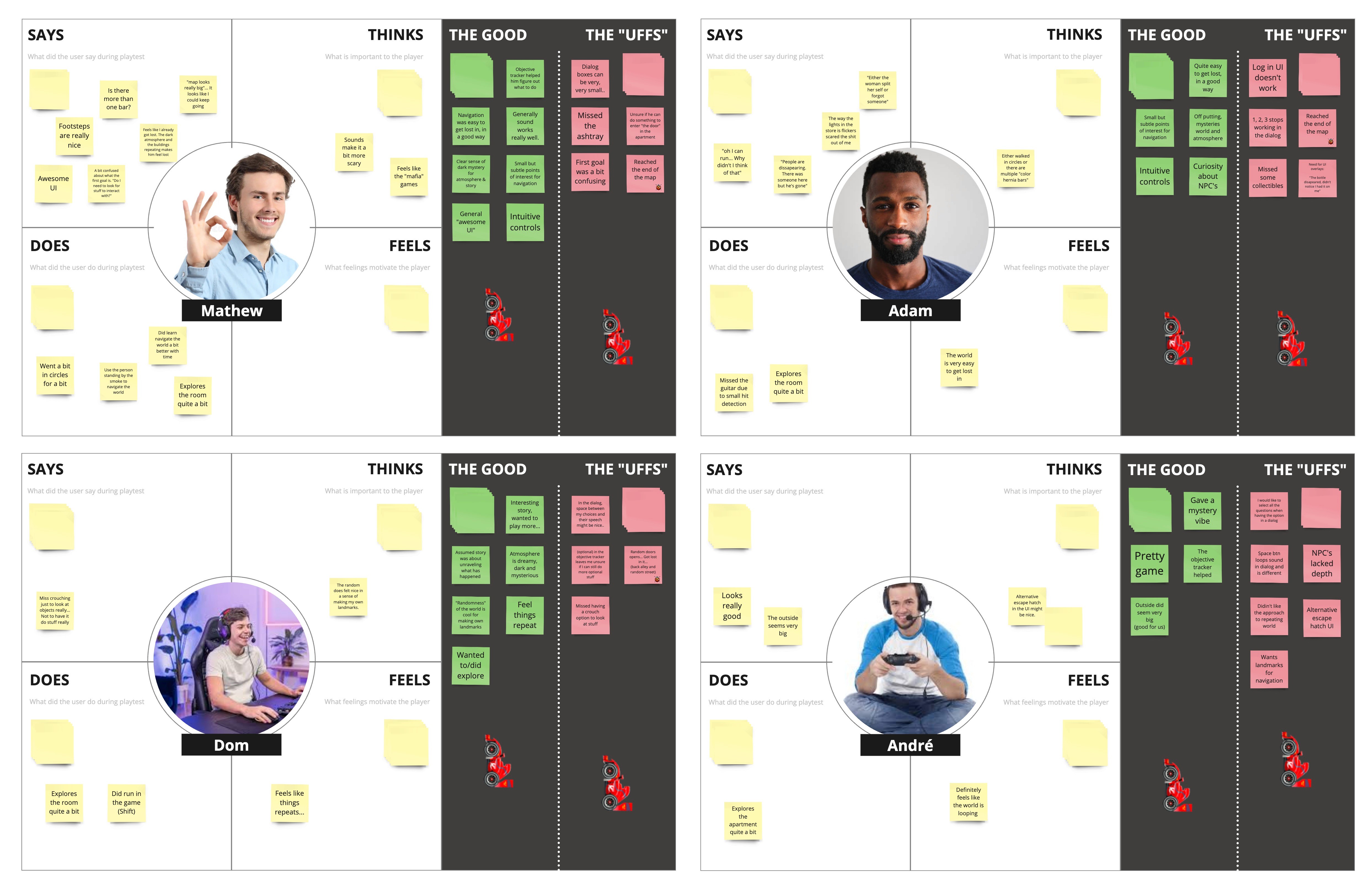
Empathy mapping of the playtesters. See the full data synthesis here
From our playtest, I uncovered key insights about the player experience:
Players experienced the intended emotions while navigating the world and UI
The world as dark and mysterious according to three out of four playtesters
The loop city engaged players and fostered increased exploration
Some created personal landmarks due to the lack of explicit ones
The game felt intuitive and navigation, controls, and UI/UX seemed logical
03
Takeaways & outcome
Learnings
During this project, I handled many aspects of the UX/UI role, particularly within the realm of game development. Although the rushed timeline affected the visual outcome of the UI, it imparted essential UX/UI lessons alongside other valuable learnings:
Working in larger teams with and across several different professions
Setting up design systems helping consistency and cross-team collaboration
Nailing the game theme by applying a solid go-to UX/UI design process
Improved playtest proficiency and extracting and filtering valuable data
2D doesn’t harm the play experience and 3D isn't always the correct choice
The final product
The final state of the project resulted in a solid foundation of a small game published on itch.io. Despite only one playtest session, many were intrigued and showed little to no pain points for the UX/UI of the game demo. For the game, I met the goals set to a fair extent and contributed to the game with:
A minimalistic UI that fitted the noir aesthetic, though impacted by descoped choices to meet the finish line
Intuitive UX and players understood their objective and general navigation
Securing a good gameplay experience with little confusion about the player's goals


See more…


