
Maersk Service Atlas

SaaS
Enterprise
Dashboard
Company
Maersk
Stakeholders
Product owners, developers, logistic managers, developers (end users)
Overview & impact
01
Foundations
The Product
Maersk Service Atlas (MSA) is an in-house tool created to simplify management of technology assets and data, as well as streamlining certification processes, reducing unnecessary costs.
Problem space
MSA was initially developed without any designers involved in the process. As the user base grew and features became more complex, usability bottlenecks began to emerge. Here, the development team requested design support, where I identified four issues:
Navigation logic became fragmented, and app/server metadata and relational data were accessed in separate, disconnected flows.
Core user tasks were inefficient, and users constantly switched contexts to complete lookup tasks.
Lack of UI consistency and scalable components led to confusion and increased cognitive load.
No scalable UX strategy in place, increasing support effort and slowing adoption.
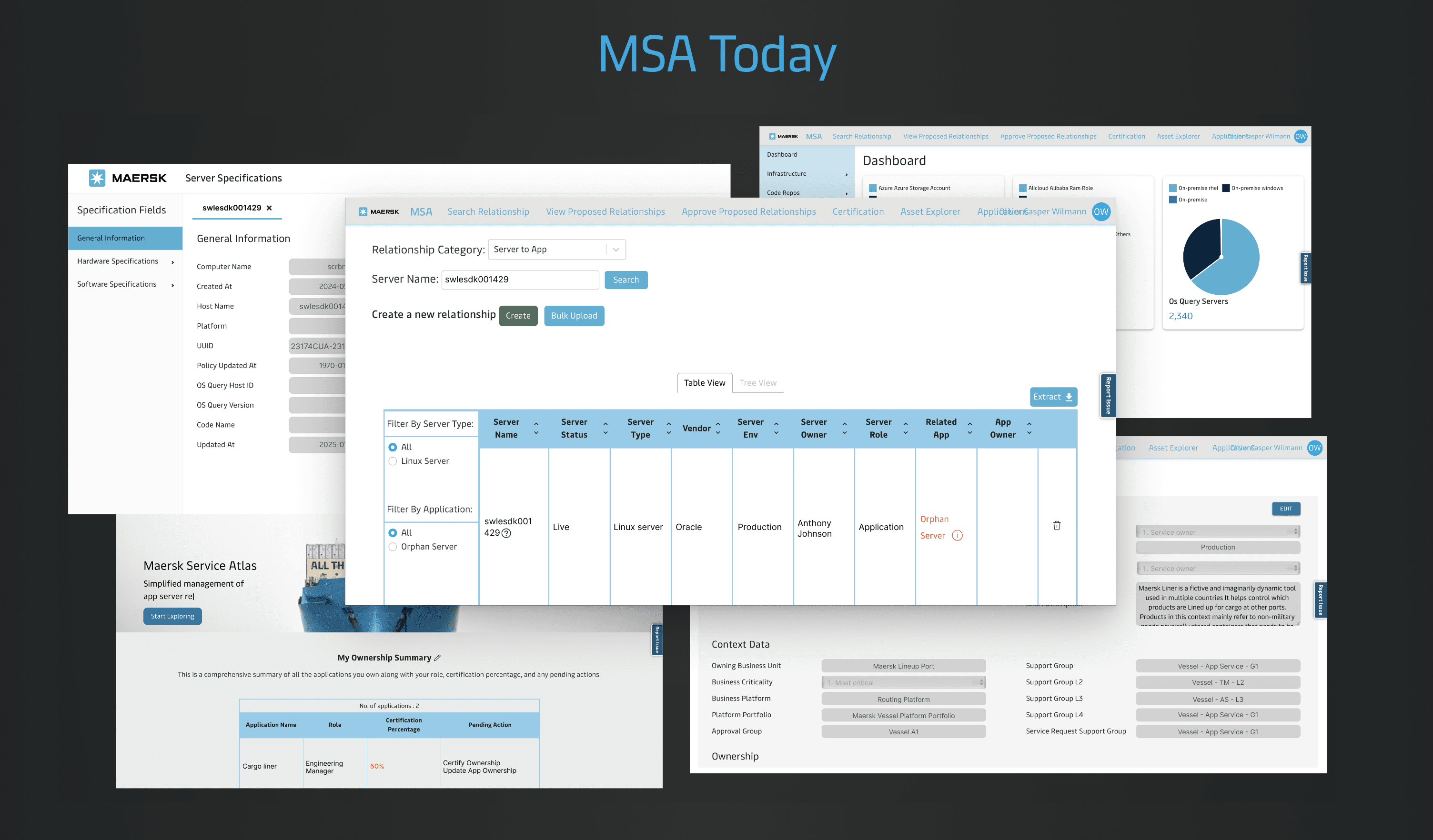
How MSA looked during the start of the project
Design goals
Unify UX patterns by applying the Maersk Design System to improve consistency and reduce learning effort.
Simplify core workflows, starting with the most frequent task: service lookup.
Reduce cognitive load & redundant actions by consolidating disparate views into a coherent flow.
Create scalable foundations for future phases.
02
THE DESIGN JOurney
Breaking it down to user-curated phases
Because MSA had no prior UX, I began by interviewing a diverse set of internal users, which helped me:
Understand the actual jobs-to-be-done.
Map out common pain points and the frequency of tasks.
Identified that service lookup is the dominant daily task, and everything else stems from that.
Users juggled multiple disconnected views to perform the same foundational work.
I mapped the platform into logical, user-anchored work categories to understand the system holistically and surface fragmentation points, allowing the redesign to resolve structural inconsistencies rather than patch surface-level issues.
App/server lookup covering both metadata and relational data
Administrative tasks covering certification and data approvals
Asset inventory covering insights into certain assets
Profile dashboard covering dashboards and tasks
Service actions covering settings, etc.
Illustration of the theme breakdown of MSA
Simplifying the service lookup flow
Despite being the main task, the service lookup process was a fragmented and disconnected environment. Users had to search for application metadata in one place and relational data in another. For servers, metadata was even more disconnected, opening in a separate browser page. To combat this complexity, I reimagined the lookup flow by:
Treating each view as a unique Lego Brick that needed to live together
Ideated a single, consistent flow for both applications and servers, with only the differences based on the search query.
Illustration of the simplification of the user flow when looking up a service
Modular UI thinking
Treating each element as a Lego brick, I introduced a modular design approach to create scalable, reusable interaction patterns that could support future feature expansion while reducing UX fragmentation. I began by analyzing the existing landscape and design patterns across other platforms to inform design decisions and generate new interaction concepts, resulting in two core modules:
A metadata module, exposing the most essential metadata
A relational module, containing all the relational data
Snippet of moodboarding and UI landscape research
Early prototype & user feedback
Early on in the design process I created a static page of a possible design solution I had. Its purpose gather insights on whether the design effectively represented the content they expected. I presented and evaluated this with four users, each with different roles and responsibilities. All users were very excited about the new design solution, however the research also highlighted a few areas for improvement, as well as two essential user needs I had to cater to:
Adding multi-select for tables as users frequently deleted multiple rows
Some way to view easily compare or swap between multiple service views
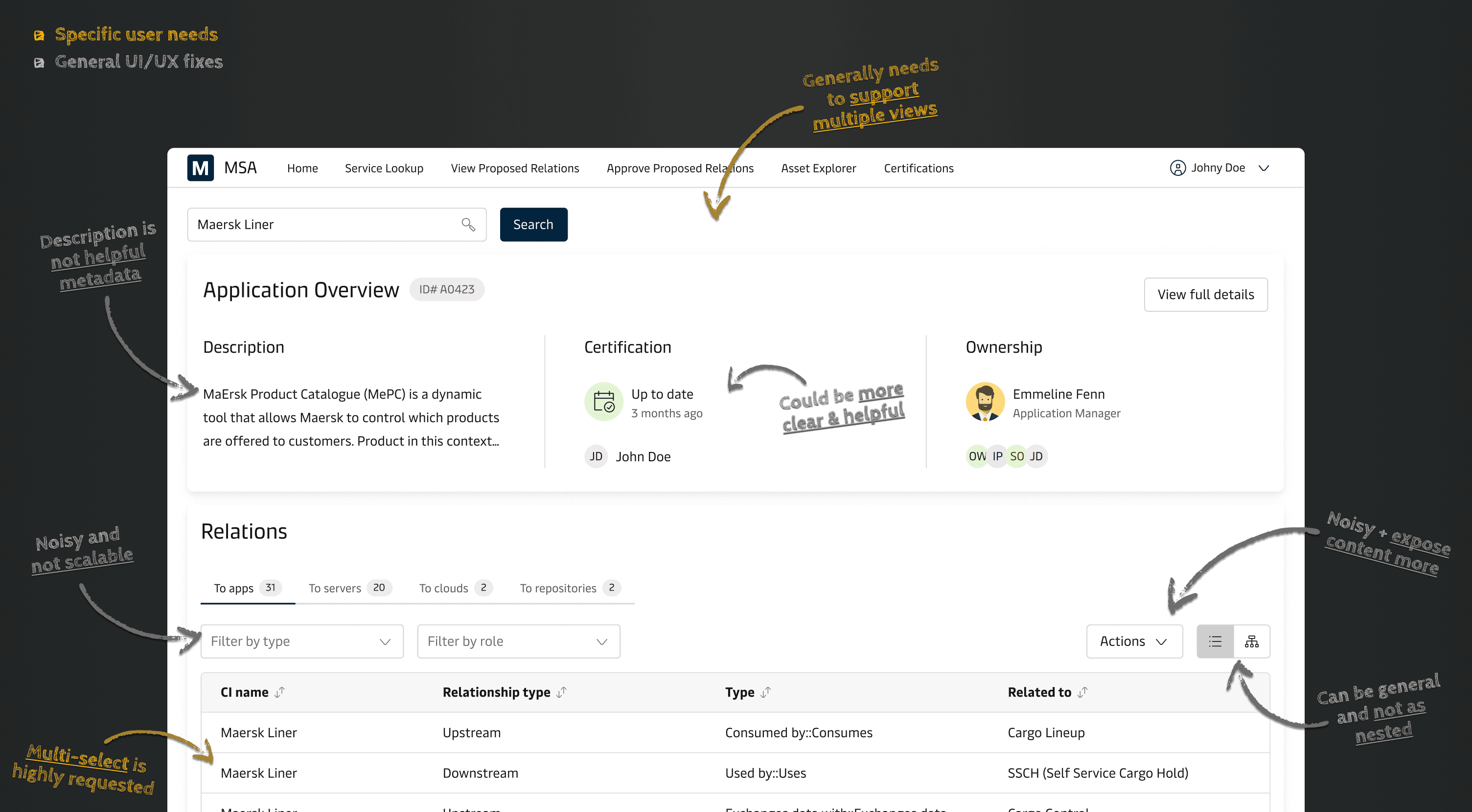
Illustration of my design iterations based on early user feedback
Towards a more user-centric design solution
The first step after the early prototype showcase was resolving the multi-select option in relational data, which many users requested. This was easily implemented within the existing design. However, the second request, supporting multiple service views, was more complex. I solved this with a multi-tab approach, enabling users to have multiple services available. This design was tested with users to validate its effectiveness. With these key needs met, I refined general UI/UX details before finalizing the project and preparing the design handover. In short this stage of the design process tended to:
Adding the option of multi-select in the relational data tables
Designing and evaluating a multi-tab solution to allow easy swapping between service views
Redesigning general UI/UX matters making the design more scalable and user-centric
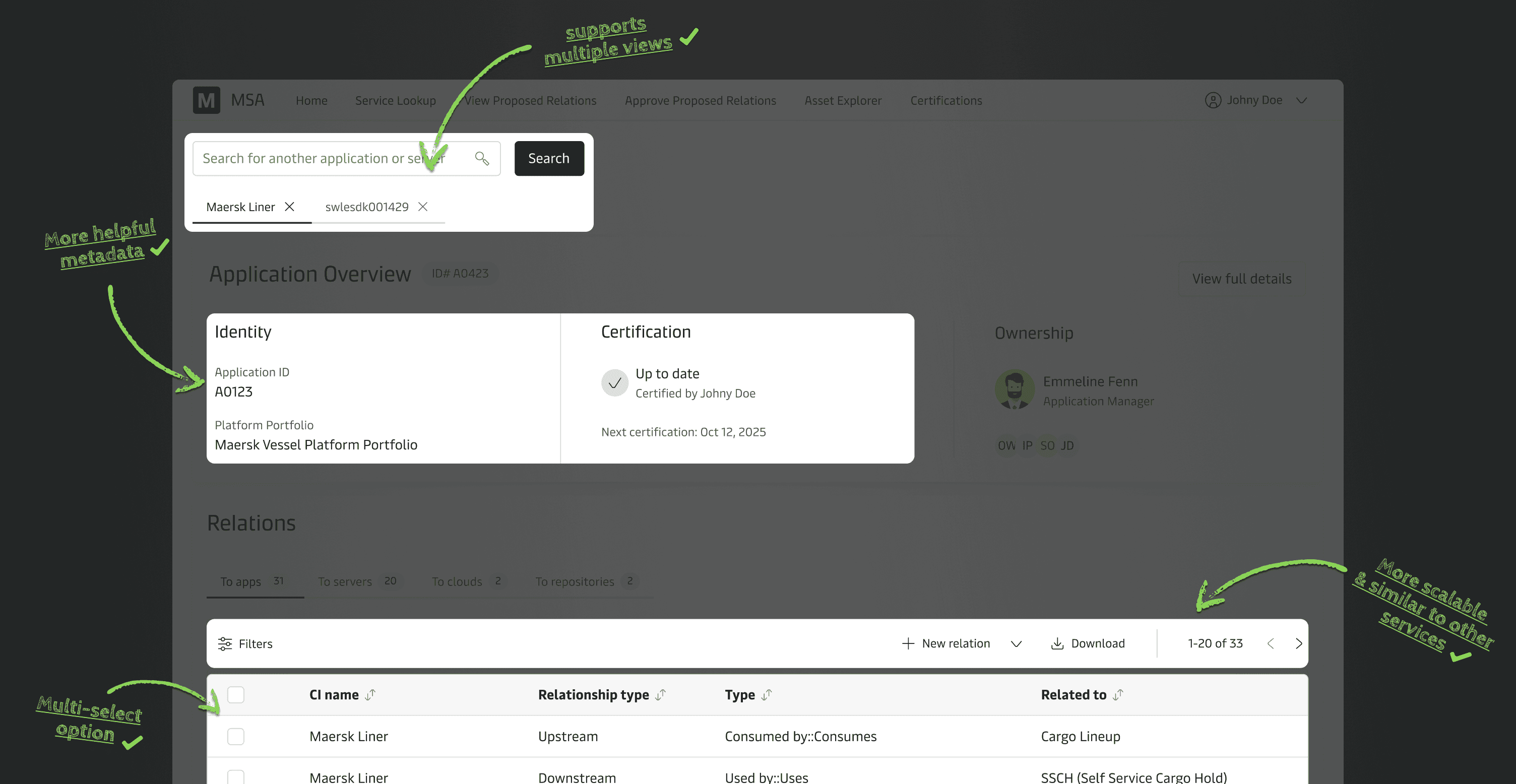
Highlights of changes to cater to user needs and internal familiarity
Handover
The final step was creating a clear and structured handover file. During this I documented all designs, flows, states, and conditions thoroughly. Moreover, I worked closely with the developers to have sections of the handover file linked up with different user stories in Jira for documentation. In order to document the handover designs I sought to:
Communicate technical aspects, herein features and behavior to ensure a shared understanding for the developers.
Organize the file thoroughly with sections, flows, states and technical considerations.
03
Takeaways & outcome
Learnings
Working on this project was a unique challenge, requiring continuous collaboration with the development team and a sample of the users. Some lack of communication on new developments led to retraced steps, which clearer transparency could have prevented. Overall, this project taught me:
Landscaping active development and ensuring changes are account from the start if necessary.
Continuously include different users to uncover and identify their needs, thereby catering to them more effectively.
Thorough handover organization and structuring files logically and clearly for development pickup.
The final product
The new design focuses on key user tasks and simplifies their journeys with a streamlined, single-page solution for service lookup testing continuously. Specific internal metrics weren’t available, but qualitative validation from users and engineering was strong. Even as a first sprint, the redesign achieved a lot within both UX gains and scalability:
Users can now access both metadata and relational data from a single interface, eliminating the need to switch between multiple disconnected views.
Users experience lowered cognitive load by adhering to the Maersk Design System.
The new modular architecture enables more flexibility and future additions from a product perspective.


See more…


