
Vivino Lists


Mobile app
B2C
Complex data
Company
Vivino
Stakeholders
Product manager, designers, developers, end users
Overview & impact
01
Foundations
The Product
Vivino is the world's largest online wine marketplace, most downloaded wine app, and home to a community of ∼69 million wine drinkers worldwide. In 2023, Vivino launched Vivino Premium, a feature-rich subscription focused on enhancing user experience by offering personalized content aimed at engagement, education, and personal tracking.
Problem space & goals
With the transition to a premium app, enhancing the user experience was crucial to maintain Vivino's leadership position and serve its vast community. This required modernizing the decade-old list structures scattered across the app, especially with new premium additions to the Cellar feature. This challenge led to two primary goals influencing both free users and especially premium users:
Revamp information architecture and introduce a logical structure for the list design, ensuring users can easily navigate and understand the content.
Design for adaptability and establish new list structures within the design system, capable of being adopted across app formats with scalability in mind.
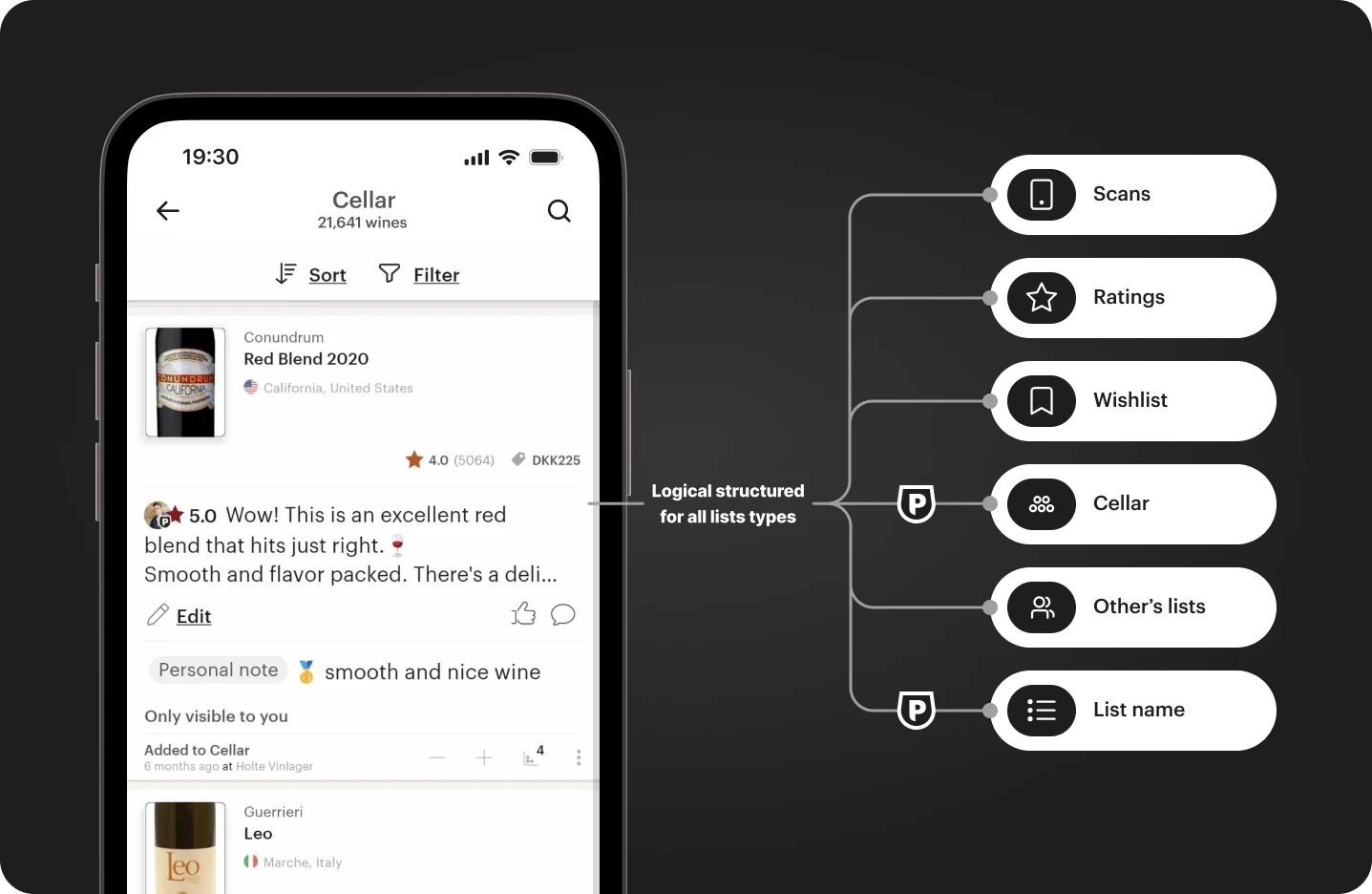
Illustration of the amount of lists the new architecture should adapt to
Audience & internal limitations
It was important to remember the users, and their purpose varied drastically. Firstly, because of the list type the user viewed, and secondly based on the user themselves and their behavior. Additionally, Vivino had the limitation of having a very small engineering team at this time. So, going into the project, I had to design around two extra variables:
Users and purposes varied based on list type and personas, but the list should make meaning to all.
Small engineering team required simple list structures, avoiding any additional complexity when possible.
02
THE DESIGN JOurney
Discover & define
The initial and important step in the design process was mapping out the elements of the lists. I did this by cataloging all the different versions of a list structure found throughout the app. Next, I mapped out what elements Vivino's list structures were made up of within three overarching categories:
Wine details
Personlized (+ user data)
Actions
Element mapping of the old list structure
Mapping the list elements ultimately revealed three issues:
Personalized data inconsistent and spread across a list entry.
User price conflict which overrode avg. price and purchase indicator.
Actions were scattered around a list entry.
I found that this step was vital to comprehend and retain valuable data, particularly personalized information as this was either heavily used or actively detailed by the user, and to identify where new premium features should be placed based on the category.
Desk research
As part of Vivino's move to a premium app, full-width embedded ads were added for free users. I decided to explore card designs to make it easier for users to differentiate between Vivino's list entries and external ads.
Snippet of some of the desk research for card structures
This process provided insights into how other apps handle card designs, allowing me to partially adopt proven design solutions. Additionally, card designs are widely used, meaning I could avoid "reinventing the wheel" and save time and resources by leveraging existing knowledge.
Exploring solutions
Starting with sketching, the exploration phase allowed me to refine ideas by removing unnecessary elements and focusing on those worth further development. This step was helpful in visualizing scalability and adaptability for all lists across the service.
Snippet of some of the list structure sketching and exploration
Initially, I made the mistake of creating too many interactions, which I wanted to avoid due to Vivino's limited engineering resources. This pitfall emerged from dialogues with the design team and QA about a possible compact solution. Yet, after a meeting with the product manager and design team, we aligned on the 2 key points for the first version (V1) of these cards:
Descope compact view and consider for later.
Emphasize adaptability and simplicity.
Brushing up mockups
Having focused on elements worthy of further design development, I went into mocking up the designs for the new list cards and applied the three categories uncovered during the initial element mapping.
Element mapping of the new list card structure
Organization & hand-over
The last step involved handing over mock-ups to illustrate the redesigned look and interactions for all Vivino list types. This included detailing various card states, such as purchasable/non-purchasable, loading, and error states, to assist the engineers during implementation.
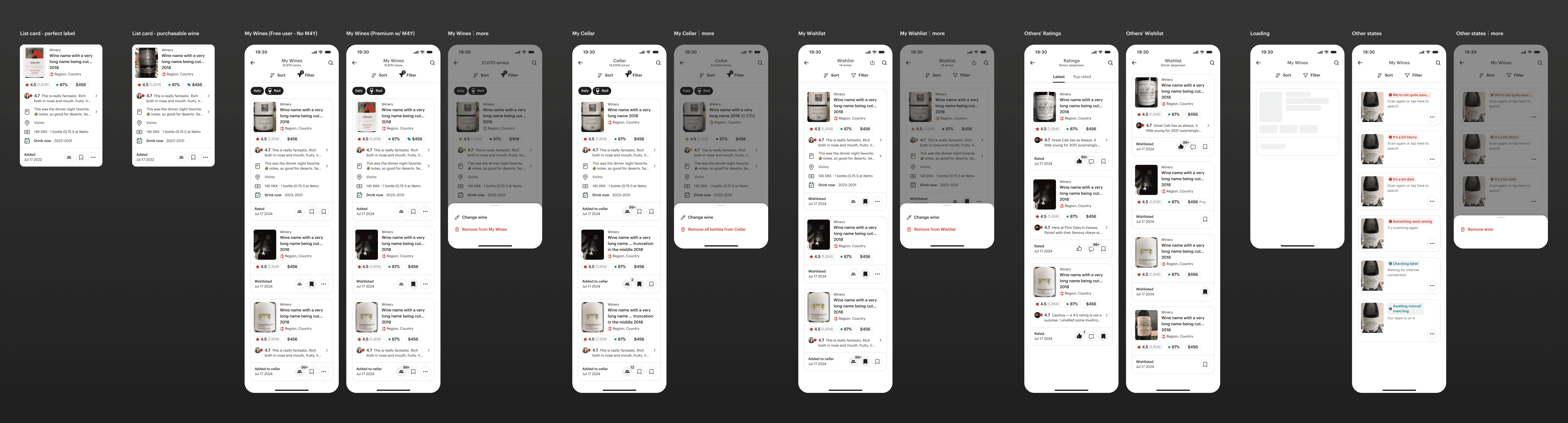
Glimpse of the hand-over organization
03
Takeaways & outcome
Learnings
Reflecting upon the project I believe I have grown as a designer. Based on my own work and sparring with colleagues, I developed a better understanding of two key principles of good design:
The value of difficult platform mapping and thoroughly examining all the aspects of an overarching issue.
Simplicity is key and doesn't make it feel less premium. Simple designs create a more seamless experience for the end-user while also enhancing internal understanding and development.
The final product
Impact metrics weren't measurable before my departure from Vivino. However, the logical grouping and clear information architecture are expected to benefit both users and Vivino in the long run by ensuring platform consistency and integrating new premium features. Ultimately the goals were met and resulted in the cards:
Becoming an essential part of Vivino's design system
Being adaptable for various list structures
Logically tended the information architecture
Being scalable to new premium data


See more…


